Address
304 North Cardinal
St. Dorchester Center, MA 02124
Work Hours
Monday to Friday: 7AM - 7PM
Weekend: 10AM - 5PM
Address
304 North Cardinal
St. Dorchester Center, MA 02124
Work Hours
Monday to Friday: 7AM - 7PM
Weekend: 10AM - 5PM

which can not only convey emotions, but also directly affect the psychological feelings of the audience. A harmonious work cannot be separated from careful color matching, which contains many artistic mysteries.
First of all, understanding the basic properties of color is the key to color matching. Color has three attributes: hue, brightness and saturation. Hue determines the basic types of colors, such as red and blue; Lightness refers to the brightness of the color; Saturation determines the purity and intensity of the color. Mastering these attributes can help us better control the overall visual effect when matching colors.
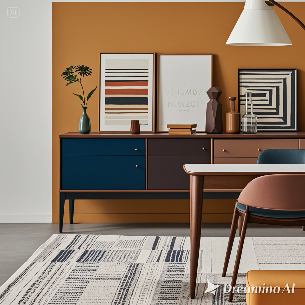
Secondly, different color matching methods can bring different visual experiences. Color matching is one of the most common ways to create a unified, harmonious effect by using similar colors, giving people a sense of peace and tranquility. For example, in interior design, the combination of beige, light brown and white can create a warm atmosphere.
Contrast color matching is through the strong contrast between colors to attract attention. For example, the combination of contrasting colors such as red and green, blue and orange can form a stark visual opposition, thereby increasing the movement and vitality of the work. This collocation method is usually used in scenes that need to highlight a certain element, such as the red and yellow contrast commonly used in advertising design, which can effectively catch the eye of the audience.
In addition, the use of complementary colors is also an important skill in color matching. Complementary colors refer to colors that are opposite each other on the color ring, such as purple and yellow. When complementary colors meet, they can enhance each other’s visual effects and form a strong visual impact. This combination is not only suitable for artistic creation, but also widely used in fashion and home design.
Finally, the emotional expression of color plays an important role in color matching. Warm colors such as red, orange and yellow convey enthusiasm and energy, while cool colors such as blue and green create a calm and peaceful atmosphere. Through the clever use of color emotion, designers can create works that can deeply touch the heart of the audience.
In general, the art of color matching lies in the grasp of balance and contrast, through the understanding of color attributes and the precise control of emotional expression, in order to create a truly harmonious visual experience. Whether in art creation, design or daily life, mastering these color matching secrets can bring us a richer visual enjoyment.
Hi, this is a comment.
To get started with moderating, editing, and deleting comments, please visit the Comments screen in the dashboard.
Commenter avatars come from Gravatar.